Yat Profiles
How we built it
Getting Started
In the early stages of the project, our focus wasn't specifically to make a profile for Yat users; instead, it was to overhaul our current Yat Page and build upon our original ideas.
Our first iteration of the Yat Page was more in line with LinkTree, and we wanted to take this idea further and create an experience where users could share their NFTs, socials, and a bio along with their favourite links.
Below is our original Yat page this project was based on.

How can we elevate our current experience?
Our first goal for this project was "how can we build upon this idea of a "better LinkTree" that allows users to show off their NFTs?". We also wanted to explore ideas and layouts that were less conventional, more immersive, and incredibly unique to the NFT space.
Below are a few early concepts experimenting with various layouts and designs.

Refining our explorations
After a few rounds of exploration, we decided to go with a horizontal scrolling layout. We liked this direction because it felt unique and almost like a slideshow of your collection. We also spaced the tiles out more, so the page felt manageable.

The Magic button
During this project, I always tried to keep simplicity and ease of use at the forefront of my decision-making. I achieved this for the authoring experience by creating a floating action button (aka "The Magic Button"). This button would serve as an entry point for adding new elements to the page and would be present no matter where the user was in the experience.
In the example below, this button could allow users to add links, NFTs, media, and notes to their page.

The NFT manager
Another vital part of the authoring experience was making it as easy as possible for users to add NFTs to their page. Some users have thousands of assets, so we needed to ensure we gave users the correct tools for exploring and filtering their collections.
The idea I came up with was to create a side panel that would display all of the user's assets and contain filters that would allow them to refine their search. Users could easily select one or many assets at a time to quickly add them to their page. The powerful part of this solution was that it was portable and allowed users to refine and edit their page quickly without being redirected anywhere.
Below is an early exploration of the NFT manager.

Refining our concepts & the final result
This project took a lot of twists and turns throughout the discovery and exploration phases, but ultimately we landed in a spot we were all happy with.
Some of the major changes we made from our explorations to the final designs were:
- Simplifying the bio section and focusing on the creator of the page
- Simplifying the grid and moving from a horizontal scroll to a vertical scroll
- Refining the NFT manager to display more information about each asset and allow for easier searching
- Adding visual flair and interactions across the entire experience
- Adding an interactive profile picture called Liquid ID

Liquid ID
Liquid ID was a late addition to the profile and not something I was heavily involved with, but it is a significant part of the profile page, so I wanted to include it here.
One thing we noticed while doing research was that many people love avatar NFTs. The issue some people face is not knowing which to choose for their profile because they have so many that resonate with them. We wanted to find a way to allowed users to display more than one so they could show off every side of their online identity.
We played around with many ideas but eventually landed on an interactive cube allowing you to add images and interact with it in real-time. We love interactivity at Yat, so this was the perfect solution.


Speccing it all out
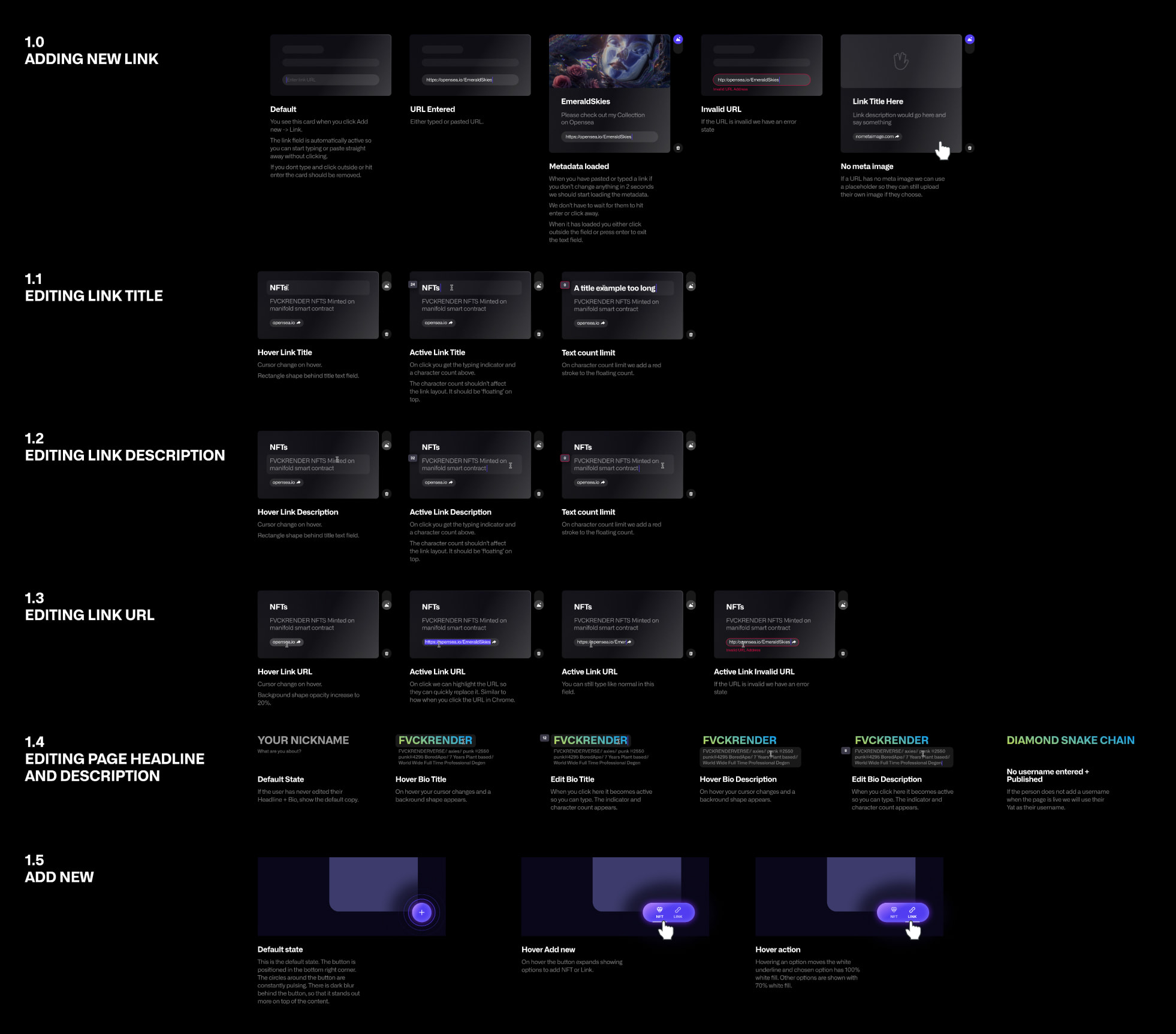
This page had many moving parts, new components, and interactions, so it was very critical that we create detailed spec sheets for each feature. When creating documents for developers, I like to create specific specs for each component, so it's easier for the development team to understand how every piece works.
Below is an example of a spec sheet created for this project.
